So I am not sure what I want to do for my programs but I saw this picture and I really like it. So in comes photoshop into the picture.
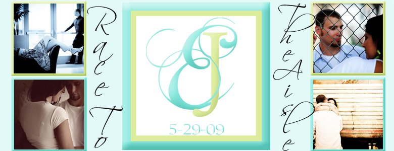
 So here is what I have so far. I put the faded design in the background to add some texture. This was also another great opportunity to use the monogram I had designed previously. Since our colors are Blue and Green I figured I could switch back and forth with the ink colors.
 This is all I have so far because we haven't sat down with the church just yet to figure out some details nor have we chosen our readings. So I obviously cant make pages for information I don't know yet :o) I will keep you posted on the progress with these, advice and opinions are gladly accepted!
 ** Ok so I have just printed out the first page to get a feel for how it will look and here is the very first mock up . . . .


I think I may like it better with the thick blue ribbion. . .oh well I have some time to think about it :o)


2 comments:
i like the thick blue ribbon better, very nice programs!!!
Thank you! Yeah def. the thick ribbon I agree ;o)
Post a Comment